Angular material is a UI component library|package to provide rich user interaction
 with angular app
Angular material is providing so many built in components and directives to provide better look and feel
Angular material is an alternative to bootstrap css

  angular material------> native | built in with angular[provided by angular team]
                          less responsive

   bootstrap css -------> third party css framework[provided by twitter]
                           more responsive

*angular material will use angular animations internally
*angular material is based on angular cdk[component development kit]

   raw gold[biscuit gold]-->mould----->ornaments [chain,ring,...]

   angular cdk[raw level]-->moulded--->datepicker,tabcontainer,..[components-->material]
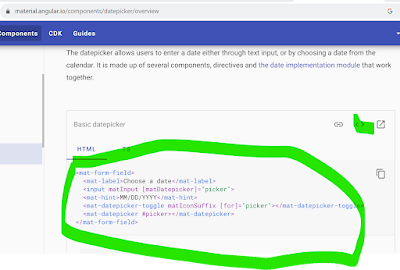
angular material is providing following components | directives: 1.mat-button --rectangular text based button without elevation 2.mat-raised-button --rectangular text based button with elevation 3.mat-icon-button --circular button with transparent color to show icon, this requiresmat-icon component syntax: <button mat-icon-button> <mat-icon> iconname [edit,delete,favorite,..] </mat-icon> </button>icon names are predefined, this can be downloaded from http://fonts.googleapis.com/icon?family=Material+Icons4.matTooltip--this will display fancy tooltip 5.mat-card --this is a container to group related text, controls,.. 6.mat-form-field--this is used to apply text based styling like floating text, underline, icon, hint,.. 7.matInput --this should be applied to textbox or text area to apply mat-form-field text based styling[like floating text,..]syntax: <mat-form-field> <input type="text" matInput> <mat-icon matSuffix>iconname</mat-icon> ... </mat-form-field>8.mat-spinner--this is used to display spinner[animated circle]ExampleGo to command prompt and install the animations package asng add @angular/materialNext check, with this below command>npm i @angular/materialnpm i @angular/cdkYou can see that it is automatically reflected in the angular.json file as shown belowstyles.cssNote: ----- ->the style files imported into styles.css will be global through out the project -> ~ symbol will substitute node_modules/Example*create a component >ng g c demo --flatdemo Component.html*goto app.module.ts ... import{MatButtonModule} from "@angular/material/button"; import{MatIconModule} from "@angular/material/icon"; import{MatTooltipModule} from "@angular/material/tooltip" import{MatCardModule} from "@angular/material/card"; import{MatFormFieldModule} from "@angular/material/form-field"; import{MatInputModule} from "@angular/material/input"; import{MatTabsModule} from "@angular/material/tabs"; import{MatProgressSpinnerModule} from "@angular/material/progress-spinner"; import{BrowserAnimationsModule} from "@angular/platform-browser/animations"; @NgModule({ .. imports: [ BrowserModule,MatButtonModule,MatIconModule,MatTooltipModule,MatCardModule,MatFormFieldModule,MatInputModule,MatTabsModule,MatProgressSpinnerModule,BrowserAnimationsModule ], .. bootstrap:[DemoComponent] }) ...OutputNote: -----Material.angular.io is a official website of angular material, this will provide samples for different material components browser material.angular.io | components ... datepicker------- basic datepicker <>[view code] | .... -->copy code


No comments:
Post a Comment
Thank you for visiting my blog